How do I make my images accessible?
Images, graphics, charts, diagrams--these are all common and useful elements to include in an online course. They’re often a good way to convey information and demonstrate relationships between concepts. But for students who are color blind, low-vision, or blind, that information can become difficult or impossible to access. By being aware of color and contrast and by writing quality alternative text, instructors can ensure that the images in their course are accessible to everyone.
Color and Contrast
Color is a powerful way of conveying information, and in a digital environment, any color you can find a hex code for is at your fingertips. But for many people, color can be a stumbling block to understanding information. For the many people who are colorblind (8% of men around the world, making it one of the most common disabilities) and the many who are low vision, poor use of color can result in a difficult, frustrating experience. But by taking the time to consider how color is used in a course, instructors and designers can make sure that students are able to understand all the information, no matter what color it’s in.
Convey Information with More Than Color
Like the standard about not relying solely on position, shape, or size to communicate information, color should also not be solely relied upon to convey information. For example, think of a colorful subway map, with the different lines indicated in different colors. Now imagine the difficulty a traveler would have if they can’t tell the difference between the Red Line and the Green Line! Use text, patterns, textures, and shapes to communicate information alongside color. Multiple indicators of information ensure that everyone can understand, no matter their visual perception.
High Contrast is Best
Color contrast simply means the difference in brightness between different colors in an image or text. Black text on a white background, or vice versa, both have very high levels of contrast, and are thus easier to read. This is especially important for low-vision and colorblind users, who may struggle to distinguish between similar color shades and tones.
By default, Canvas is designed with high contrast in mind: white backgrounds and black or dark green text. But for other images or graphics, you can use a color contrast checker (like this contrast checker provided by WebAIM.org) to ensure that there’s a high level of contrast between the colors.
Colorblind Design
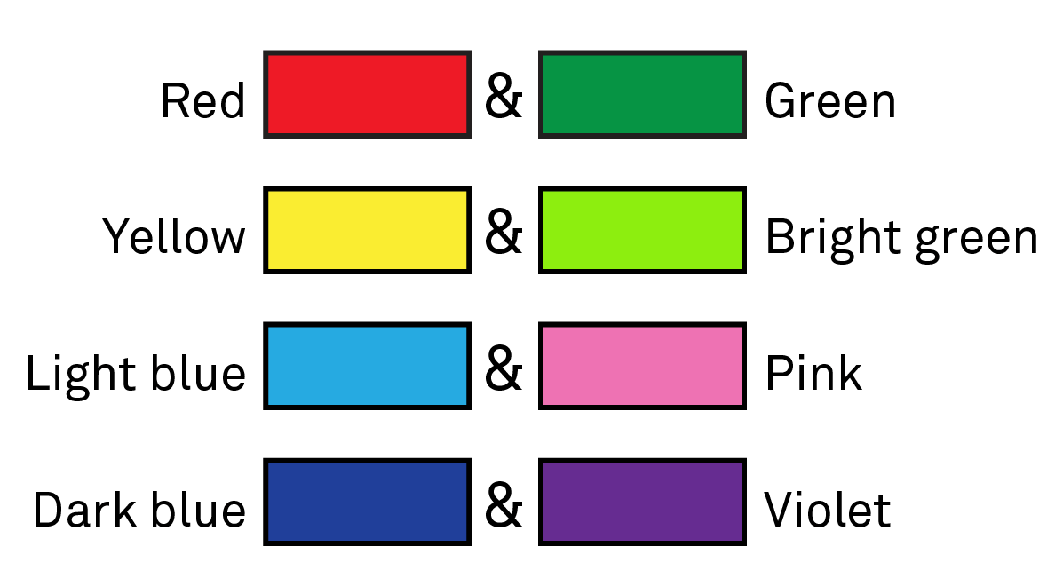
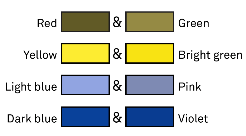
In addition to high color contrast, being careful with color choices is also important for colorblind design. Certain colors are more difficult to distinguish. For example:

 If you’re not colorblind and are concerned that you’ll miss some of these combinations, don’t fear! There are numerous resources available to help. Most image editing programs have colorblind simulation filters, and COBLIS allows you to upload an image and apply various colorblind filters as well. If you’re creating maps, check out ColorBrewer, which provides colorblind-friendly palettes for maps and other data visualizations. Color Oracle is a free desktop program that applies a colorblind filter to your entire screen, independent of the program you’re using, so you can view everything on your computer from a colorblind perspective.
Alternative Text
Alternative text (commonly referred to as alt text) is a crucial accessibility support online. A text description of an image allows students who are blind or low vision to get the same information as students who are able to see the image. However, writing alt text is more of an art than a science; there isn’t a single, straightforward formula for how to write it.
Before getting into the details of how to write alt text, let’s go over the options for adding it to an image in a course site.
Alt Text Field in Image Uploader

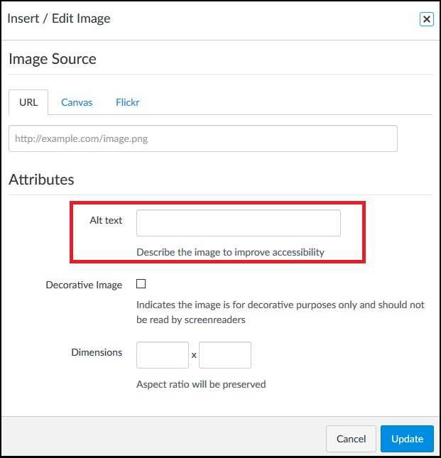
When uploading an image to Canvas, there is a field labeled Alt text. You can easily add short alt text to an image by entering it here. This is the best option for simple images with a short description or banners with only a few words of text. For instance, the alt text on the image here reads: “Canvas image upload window with alt text field highlighted.”
Description in the Text
Another option is to describe the image in the surrounding text. This is often a good option for more complex images, especially if you want to draw the attention of all students to particular pieces of information in the image.
Separate Content Page
For very lengthy, detailed, and/or data-heavy alt text, you can create a separate content page in Canvas and provide a unique and descriptive link to it with the image.
Key Concepts
Never leave the file name as the alt text on an image.
By default, Canvas fills in the file name as the alt text when uploading an image. Under no circumstances is the file name acceptable alt text. Even if you aren’t inserting alt text at the same time that you’re uploading the image, be sure to delete the file name from the alt text field.
Context is key.
The alt text that an image needs depends not only on what the image is, but on the information surrounding the image. What information is on the page that relates to the image? What information do students get from viewing the image? What information does the image itself communicate?
Decorative images don’t need alt text.
After considering the context and what information it conveys, you may reach the conclusion that it doesn’t convey any information. It’s an icon included to help students quickly identify different elements of a module overview page, or it’s a stock photo used to break up a wall of text. But it doesn’t actually have any academic purpose. In that case, it is decorative and does not need alt text. The alt text field should be left blank.
Describe the information, not the image.
This can be a tricky concept! Images are a way of conveying information, just like text or speech. For simple images, like this photo of a kitten on a couch, the information conveyed is pretty straightforward.

The alt text for this could be “a sleepy orange kitten on a couch.” If you wanted to get really detailed--and if it was relevant for the viewer to know--you could describe the fact that it is a close-up shot, or the placement of the kitten’s paws.
Unfortunately, there aren’t many opportunities to include pictures of kittens in our course sites. More often, faculty will ask students to look at complex charts, graphs, diagrams, or maps.

Organizational Transformation image taken from ORG BEH 301. Do not redistribute.
When writing alt text for this image, it’s important to focus on the information, not what the image looks like. Talking about the color of the lines or their position on the page isn’t helpful to a student who can’t see the graphic in the first place. Students need to understand the connections between each element in the diagram, what parts lead into each other, and so on.
Write out the text on the image.
Related to the above, if your image contains text, that text should be included in the alt text… as long as it isn’t redundant with other text on the page. So if you include a screenshot of a page from a book, the alt text would need to transcribe the text on the page, which rather defeats the purpose of taking a screenshot. In general, if there’s a lengthy section of text that’s going to be included, type it out or copy/paste it and add it (with appropriate citations!) as a quote, rather than an image.
However, things like header banners will have a brief amount of text, and that text can be repeated as the alt text. But again, consider the context. If the text on the banner is the same as the page title, it probably doesn’t need alt text.
Don’t start alt text by saying that it’s an image.
Thanks to the HTML code of the course site, a screen reader will be able to identify that an item is an image and will communicate that to a user before reaching your alt text description. So it is unnecessary, in most cases, to start your description by saying “an image of” or “a graphic depicting.” Just launch right into the description. The one exception to this rule is if the nature of the image is relevant information for students to have. For example, if it’s important to know that “green, rolling hills stretching to the horizon under a bright blue sky” is a painting and not a photo, then you can begin the description by saying “a painting of…”. But that is a rare exception and in general, specifying the type of image is not necessary.
Questions for Alt Text Authors
It can be hard to get into the right frame of mind to write alt text, especially for complex images. Here are some prompts and questions to ask yourself (or the person who is writing the alt text) to start thinking about it.
- Imagine you can’t use an image to communicate the information to the students. What would you need to write so that they learned the same thing?
- What are the key things (top three, top five) that students need to understand by looking at this image?
- How is the knowledge gained from this image going to be assessed? What will students be asked about that relates to this image?
- If you took this image out of the page and replaced it with the alt text, would the page still make sense?
Additional Resources
- WebAIM: Alt Text: A quality, detailed introduction to alt text, with an emphasis on considering the context.
- Diagram Center: Guidelines for Describing STEM Images: In-depth guidelines and recommendations for writing alt text for graphs, charts, and diagrams.
- Accessibility at Penn State - Images: Information on how to write descriptions for a variety of images, including flowcharts, mathematical formulas, and more.
- SPS DL Online Learning Webinar: Alternative Text: This webinar provides an introduction to alt text and includes opportunities to practice writing alt text for various images.
- SPS DL Blog: Uncomplicating Alt Text for Complex Images: This blog post goes into more detail about how to write alt text for complex images, like graphs, charts, diagrams, and maps.
- Design and Illustration for the Color Blind: A lengthy and detailed list of tips and recommendations on creating images that are colorblind-friendly.
